Let’s create beautiful landing pages together
From questioning to understanding, we try to make your life easier by providing tutorials and tips to help you create shoppable landing pages.
Welcome to this website filled with different guides and tips, all about creating and improving your online presence.
I am not a coder or a web developer. I am just an ordinary person who specializes in creating content, spending the past 3 years researching and building websites via different tools.
This is a website to prove that everyone can build a website, including YOU!
What can you find here?
'How-to' Articles

Website Best Practices

Online Marketing Tips
Create and publish a landing page for your business today
Did you know the average landing page conversion rate was around 2.35% across industries, while the top 25% of landing pages were converting at above 5%? Some conversion rates among the top 10% performing pages even went up to 11.45%. Study shows that businesses with 10-15 landing pages generally increase conversions by 55% compared to those with less than 10, those with over 40 landing pages can even increase their conversions by over 500%.
So if you are asking me if you need a landing page? There’s only one answer: YES!

How to create a landing page
A step-by-step guide for beginners
WHAT IS A LANDING PAGE?
A landing page is a standalone web page, usually used for marketing or advertising purposes. This is the web page your visitors will land on after clicking on an ad on another website or from social media, or a link from a promotional email.
One major difference between landing pages and regular website homepages is that landing pages are typically designed with a specific goal in mind. It could be a landing page for booking an open house event, an RSVP page for a product launch press conference, a Black Friday Cyber Monday sales page, etc. A well-crafted landing page with a strong and persuasive call to action (CTA) can transform your web page into a lead generation machine.
IDENTIFY THE GOAL OF YOUR LANDING PAGE
Before we jump to how to create a landing page, let’s first ask yourself, what is the goal of your landing page? Are you promoting a product? Are you promoting a service? Is it an event promotion page?
Landing pages typically fall into three main categories:
-
Click-Through Page
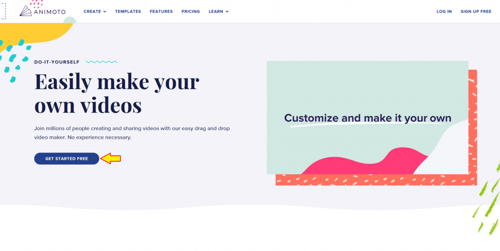
A click-through page is the most popular type of landing page where you will see a clear and sharp CTA button. The goal of click-through pages is to persuade potential customers to click the button. By the end of the day, your goal is to get your potential customers into your sales funnel.
Animoto’s website is a good example of a click-through page that has a good balance of information about their service, links leading to pages that further give details of specific features, and a good mix of text and multimedia elements to attract their visitors. And when you click on any CTA buttons on the web page, it will eventually lead you to the same “Create a free account” or log-in popup screen.
Screenshot of Animoto
-
Squeeze Page
Squeeze Page, also known as a lead capture page, is very similar to a click-through page. It is also aiming to turn a visitor into a lead but with one big difference. Rather than clicking the CTA button and bringing the visitor into the sales funnel, it is aiming to collect two specific pieces of information from the visitors: their name and their email. The idea behind these pages is to “squeeze out” your visitor’s information, to persuade them to willingly provide their information knowing that they will get something valuable in return.
A great example that I could think of would be the Morning Brew, a daily email business newsletter for young business professionals. The web page design is simple, showing the latest articles giving you a glimpse of what kind of content this media company writes. If all I need to give is my email and I can “become smarter in just 5 minutes”, why not?
Screenshot of the Morning Brew
-
Sales Page
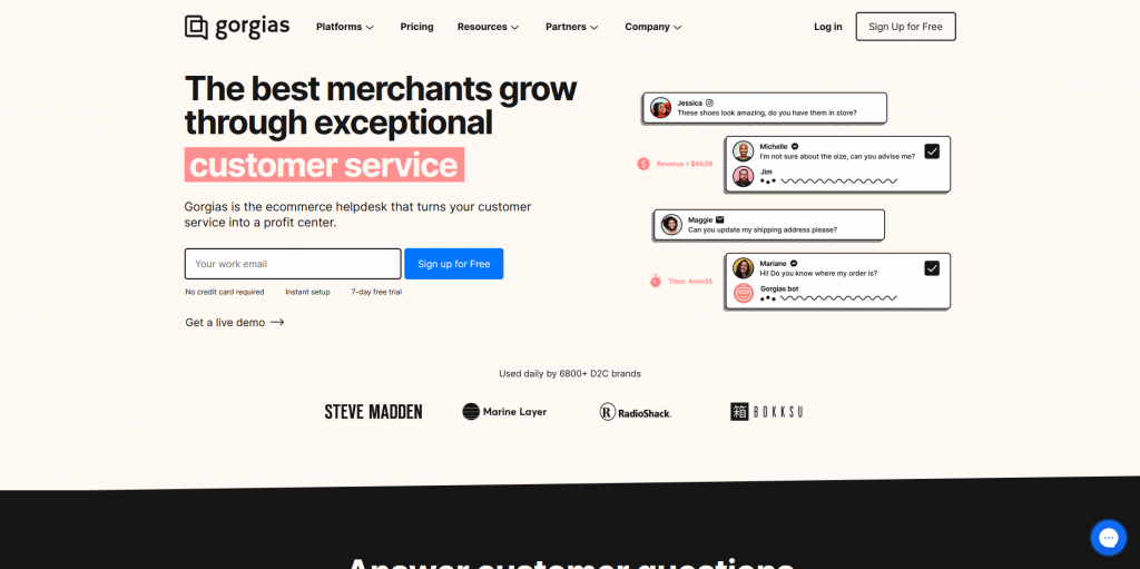
A sales page, or an infomercial page, is a longer form of a landing page with a lot of information about a particular service or product. The reason behind the way people craft these sales pages is to keep the visitors engaged with the content, making them read through the web page from top to bottom and get to know more about what you are promoting.
Gorgias is an ecommerce helpdesk application—an omnichannel customer service platform for online stores. All their promotional web pages are presented in a sales page format, showing product photos, a list of benefits of using their platform, customer testimonials, and ending with a column for visitors to enter their email and a “Start your Free Trial” button.
Screenshot of Gorgias
LANDING PAGE MUST-HAVES
Now that you know the different types of landing pages, let’s talk a bit about the must-have elements.
-
CTA buttons
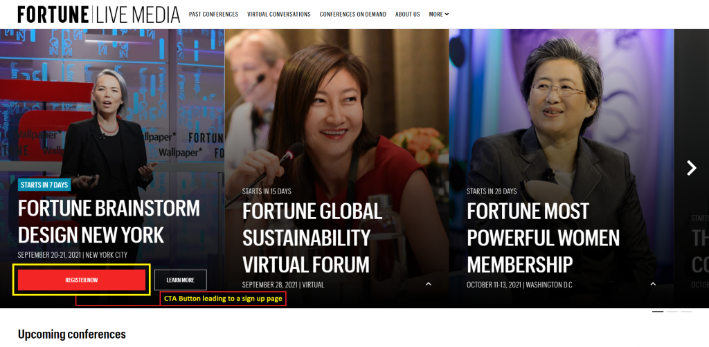
CTA is the action that you want your visitors to take. A CTA button is basically the navigation link to guide your visitors to a specific destination and potentially make or even complete a conversion. To put it in simple terms, say you are promoting a conference, your goal is to get people to attend the event. So the CTA would be to get people to sign up and pay. If you have another designated page or a popup for people to input their details and start the payment process, the CTA button on your landing page would be something like “Register Now”.
Source: FORTUNE
-
Hero Banner
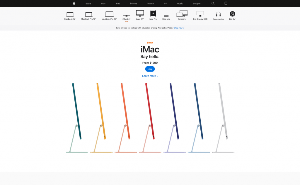
A hero banner is a full-width section that appears “above the fold”—the area that is viewable on a person’s screen before scrolling. Content in this area is what your visitors will be seeing the moment your web page finishes loading, it’s their very first impression of your web page. A hero banner should be captivating and engaging to your visitors once they land on your landing page, to capture your visitors’ interest and lead them to take an action.
The content and design of your hero banner differ depending on the purpose of your landing page. Common elements include an eye-catching headline, relevant multimedia element (graphic, image, or video), and a strong CTA. The general rule of thumb, keep the most vital information in your hero banner.
Source: Apple
-
Web Form
Web forms are essentially a medium for users to input information and communicate with the website owner. There is no “one size fits all” approach when creating a web form, the length, elements, and formats varied case by case. In general, a web form should have:
- A straightforward headline which visitors will know what to do in a split second
- Relevant form fields for visitors to input their details, fields should make sense as to why visitors would need to provide the specific information needed
- Submission Button for visitors to send out the completed web form without hesitation or confusion
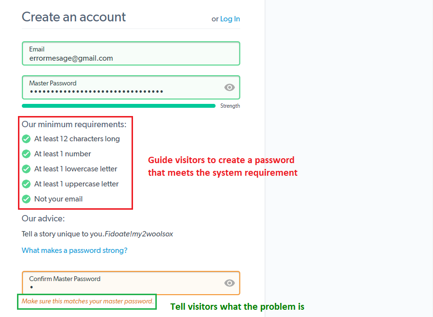
Error Messages (or instructional messages) are used to guide visitors to input “correct” information in the form.
Source: LastPass Create an account page
Here are some examples of the different kinds of web forms (with examples!)
- Contact forms
This is how your visitors ask questions, voice concerns such as giving a reason to why seeking a refund or just to connect.
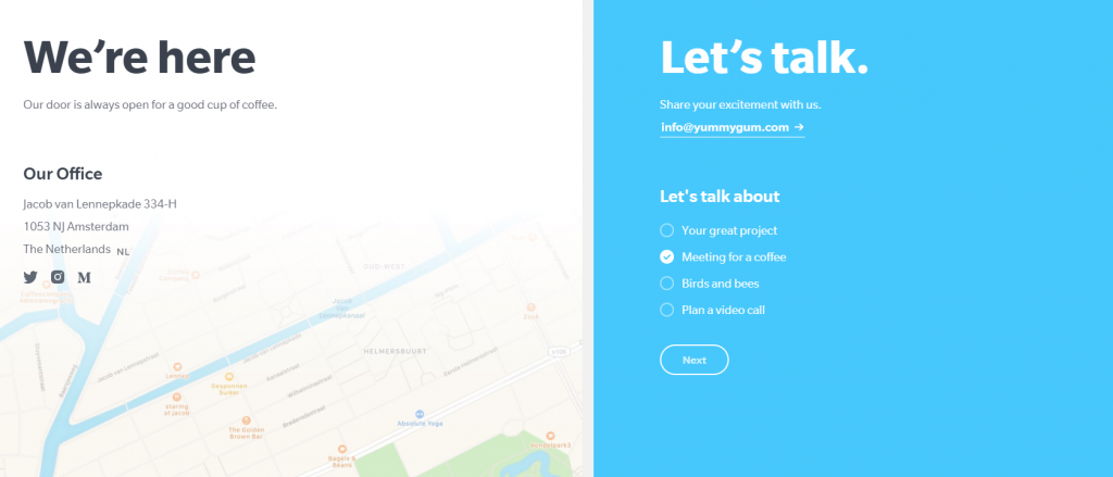
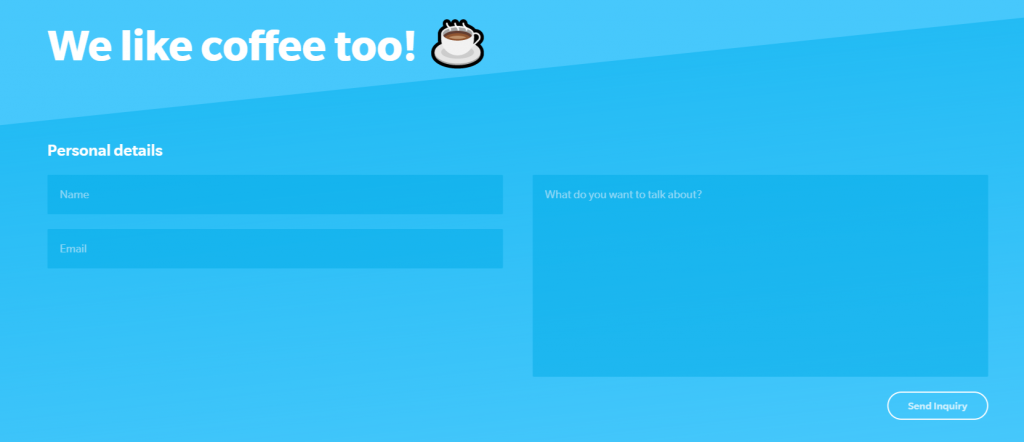
Amsterdam-based digital agency Yummygum’s two-step contact form, the first step asking for the purpose for connecting.
After choosing the purpose, they will lead you to the actual contact form
- Registration form
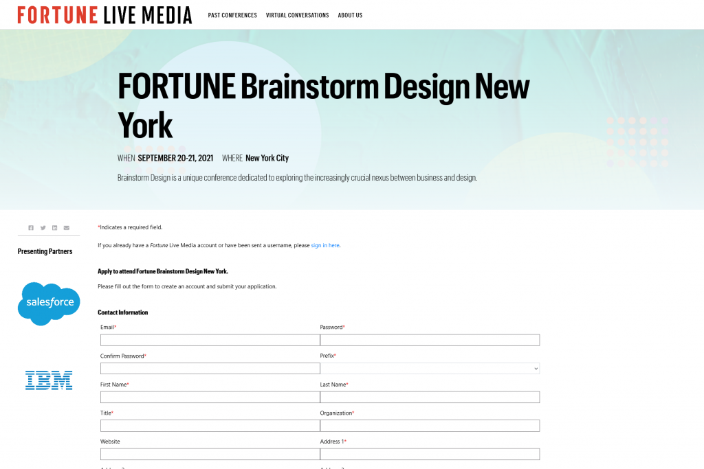
This is where visitors will input their details and sign up for a product or service if they are interested.
Fortune Media’s registration page for one of their conferences
- Lead generation form
These are forms to convert your website visitors into potential leads. It typically requires certain information including name, email address, phone number, and in some instances, username and password if your website offers online services.
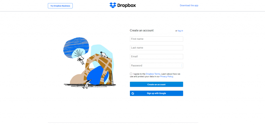
Dropbox’s simple form only requires the visitor’s name, email, and password to create an account to use their service.
CHOOSE A PLATFORM FOR YOUR LANDING PAGE
There is a wide variety of platforms allowing you to create a landing page—content management systems (CMS) platforms, landing page builders, and website builders.
- CMS platforms such as WordPress offer much more flexibility when it comes to building a website, but at the same time requires a bit more technical expertise and has a steeper learning curve. If you know some coding and wouldn’t mind spending hours customizing and modifying the codes in your template, you will be able to get exactly what you want. However, it is also an open-source platform, meaning although there are tons of guides and tutorials out there, if you encounter any technical issues, you are pretty much on your own and you are responsible for dealing with them.
- Landing page builder, like the name suggests, is a platform where you can create landing pages using one of the many templates available. Platforms like Unbounce, Instapage, and Leadpages are examples of landing page builders, all their templates are specifically designed to fit different needs. All for landing pages.
- Website builders like Wix, Squarespace, and Website.com are very much similar to CMS platforms, but much more intuitive and easy to use. It has a visual editor where you can just drag and drop elements onto your web page. It is super user-friendly particularly for beginners without technological expertise. The downside of these website builders compared to CMS platforms? It is relatively less flexible and customizable.
When thinking about building landing pages, also think about whether or not you would want to create a website and build up your online presence, allowing you to attract more visitors and web pages providing details of your product and/or service that you are promoting on your landing pages.
CMS platforms like WordPress genuinely are a bit harder to master, making it not the best ideal option for everyone. However, if you’d wish to take on the challenge and use WordPress to build your website, you certainly can. At the same time, you will need to look for a web hosting service company to host your WordPress website. Like website building platforms, there are also plenty of available options out there. I would personally recommend choosing Doteasy, a WordPress hosting service provider which offers WordPress pre-installation service and auto-update service. It is also a certified green web host, a web hosting company that uses renewable energy to power its web servers. All of Doteasy’s data servers are located in British Columbia, Canada, primarily powered by renewable hydropower. A climate change nerd I am, this is very important since web hosting is an extremely power-intensive industry.
Another notable mention: Doteasy’s in-house customer support team, which comes in handy particularly when using content management systems (CMS) like WordPress. Not only is WordPress relatively hard to master and troubleshoot by yourself, but the CMS platform also requires constant system updates. I personally had come across different technical issues such as sudden display changes of my website after updating. There are several scenarios including a sudden WordPress system update leading to a coding conflict with the theme and/or plugins, or there weren’t any available theme and/or plugin updates to accommodate the changes in WordPress. I’ve tried Googling a solution that wouldn’t require any CSS codes since I wouldn’t want to mess up anything. However, after several failed attempts of finding a solution that meets my technical level, I’ve decided to reach out to the Doteasy customer support team for help. Unfortunately, since there weren’t any available updates from the theme provider, I’ve ended up resolving the issue by using a set of CSS codes provided by their in-house WordPress expert and web developers. At least with the set of customized codes and clear instructions on how to use it, I wouldn’t need to worry much about potentially crashing the website.
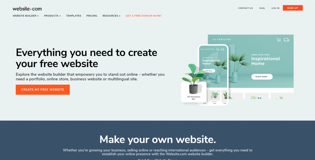
Having experienced this, I’ve soon decided that website builders might be a better option for me. A lot of options out there, but I am happy to suggest using Website.com, a simple to use drag-and-drop website builder which not only allows users to create landing pages but with the opportunity to expand into a website later. What’s more important? It offers a free plan giving users access to almost all their platform features, and you can opt to upgrade to their paid plans as your website grows.
HOW TO CREATE A LANDING PAGE?
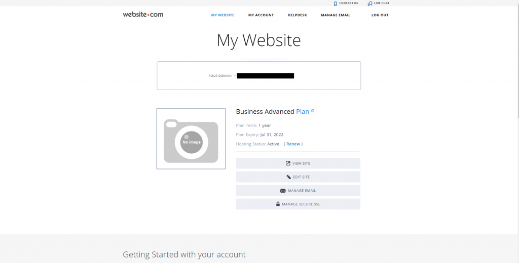
Go to Website.com and select a plan that fits your need
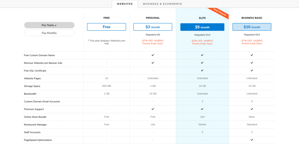
You have the option to first try out Website.com’s free plan and later upgrade to paid plans as your website grows. Click here to check out Website.com’s price plans.
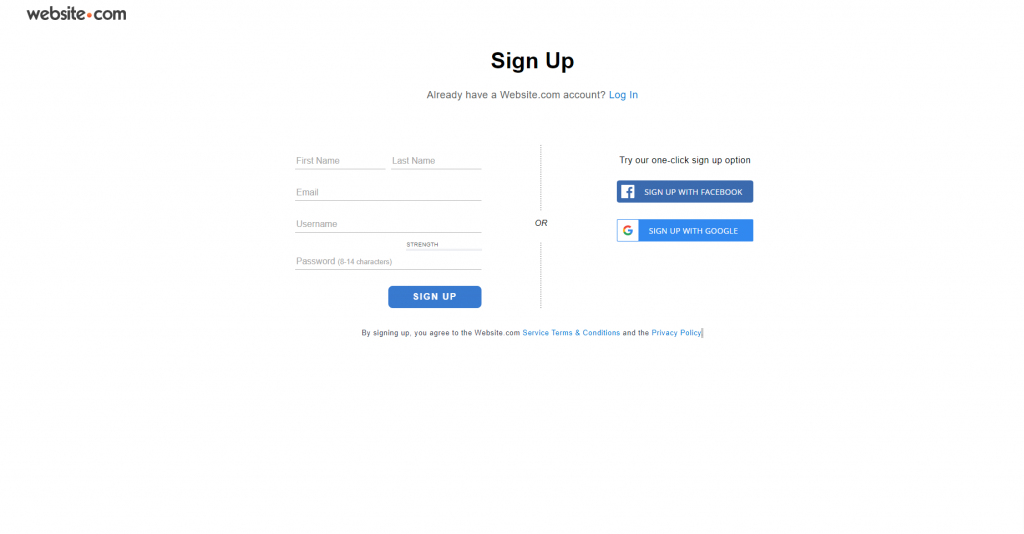
After choosing your plan, you can start signing up for an account
Create your domain name
You will also need to choose your domain name at this stage, this will be your “online name” representing who you are. For this example, I have signed up for a paid plan to get a free custom domain name. If you are serious with your business, it is always preferred to register for a domain name, it gives your online presence instant credibility and makes it easier for visitors to search for you.
Here are a few tips on how to create your domain name:
-
Make use of your name or your business’ name
One way to make your website name memorable is to make use of your name and your business/company name. And in case you’ve got a very common name, you can add your profession or hobby to your domain name.
-
Use a common domain extension
Examples of common and traditional domain extensions include .com, .net, .org. These are the most popular ones that will come up in people’s minds and generally be taken as credible and professional. Other relatively new extensions in the market are .ai, .io, .co, etc..
Additionally, if you know where your intended audience will be at, or you want people to know where you or your business is located, you can also choose to use geographical specific domain extensions (country code top-level domain, ccTLD) such as .us, .ca, .uk, .de, etc. Certain ccTLD have specific requirements for registration. For example, to register for .us ccTLD (United States), the registrant must be a U.S. citizen, resident, organization, or a foreign entity with a presence in the United States.
Feel free to go to Doteasy’s website to check out some of the potential domain extensions you can use.
-
Keep it short and easy to spell
Make sure your domain name is easy to spell, you can never predict the English capability of your potential visitors. If your name is too long, simplify it. Also, try not to include the same alphabet multiple times. The more repetitive it is, the higher the chance people can misspell your domain name.
After choosing your domain name, you’re ready to start building your landing page.
Choose a landing page template
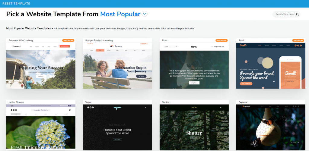
The next step now is to choose a template that you like. There are over 500 website templates nicely crafted by Website.com’s website designers to fit different needs.
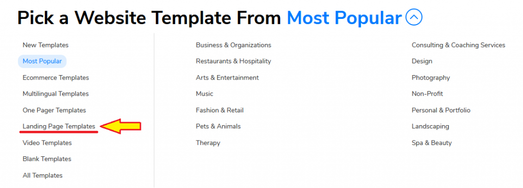
Click Most Popular and you will see the website template dropdown menu, click Landing Page Templates to check out what Website.com is offering.
For this example, I’ve chosen the Legal Advisor website template to walk you through the steps to creating a landing page.
Note: If you can’t choose from any templates offered by Website.com, you can also choose to build everything from scratch. However, if you don’t have much idea about building a web page and it’s your first time designing a landing page, I will still suggest you stick with a template and customize it. These are all pre-built templates designed by professional website designers. All elements including fonts, font sizes, color palette, layouts are handpicked and structured by Website.com’s website designers. You can always change and replace existing texts and images to suit your needs.
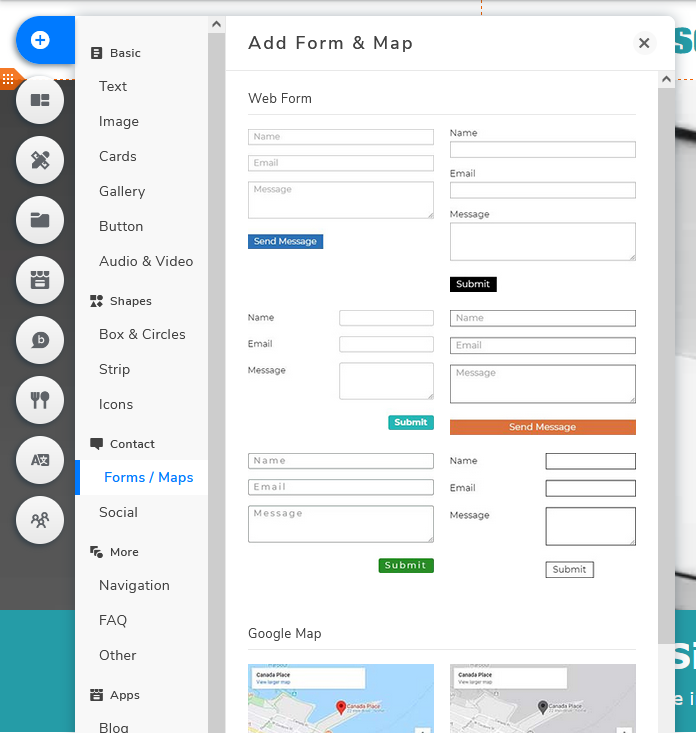
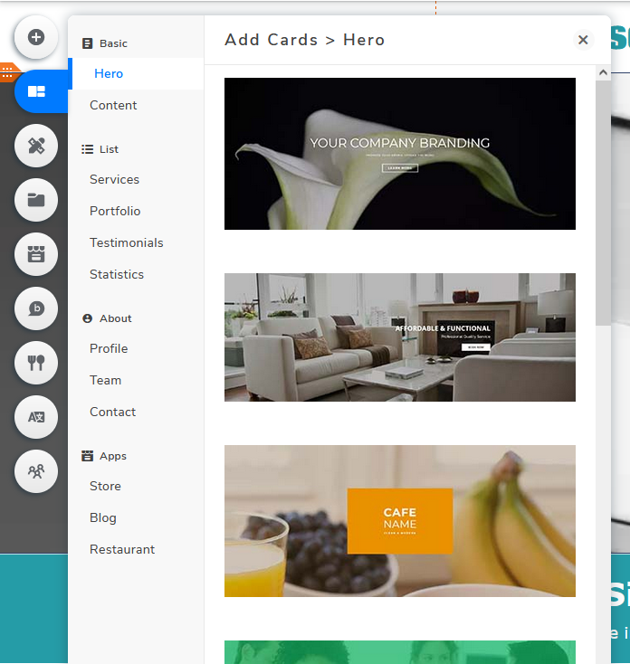
If you want to add additional elements to your landing page, you can easily add them by clicking Add Elements or Add Cards.
Add Elements
Add Cards
To change the element text, click the text you would want to edit and press the Edit Text button.
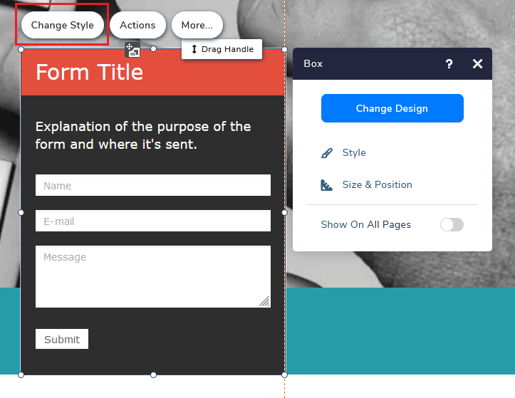
To change the design of a specific card, in this case a web form box, click Change Style and a pop-up will appear. You will have the option to change the background, border, and shadow of the respective elements.
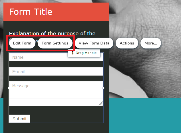
To edit the content or the setting of the web form, click on the web form element then choose Edit Form or Form Settings.
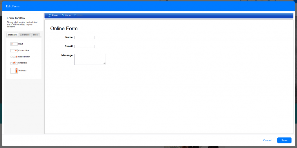
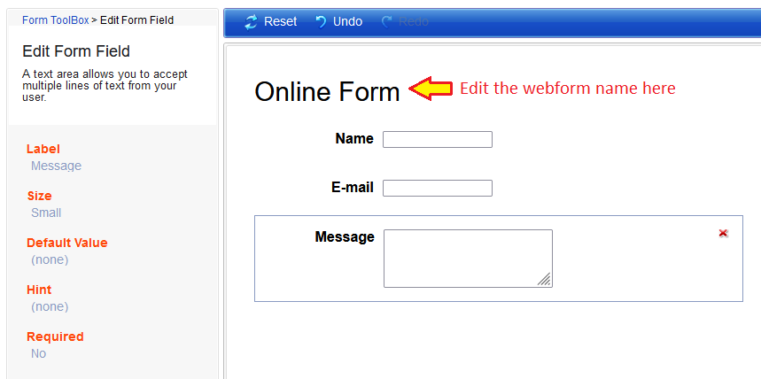
On the Edit Form interface, you can add, delete and reorder the fields.
If you click on a specific field, you’ll be able to further edit specific fields such as changing the name or changing the mandatory settings. You can also edit and rename the webform if you have more than one.
Once you’re done, remember to click Save at the bottom right.
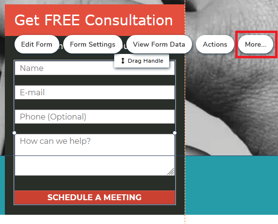
To change the Submit Button, select the web form element and click More.
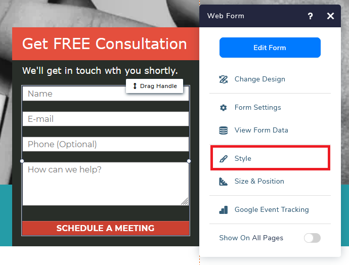
Next, select Style to change the button.
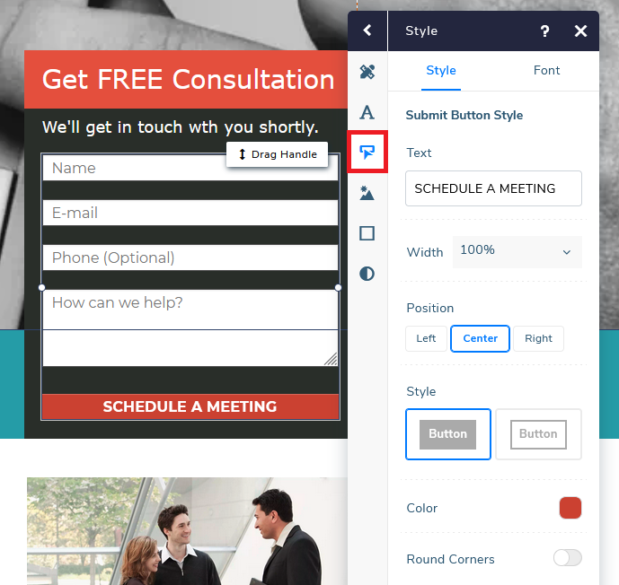
Click Submit Button and you can start customizing the details.
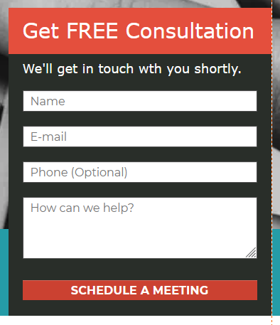
Here’s an example after I’ve changed the content of the web form.
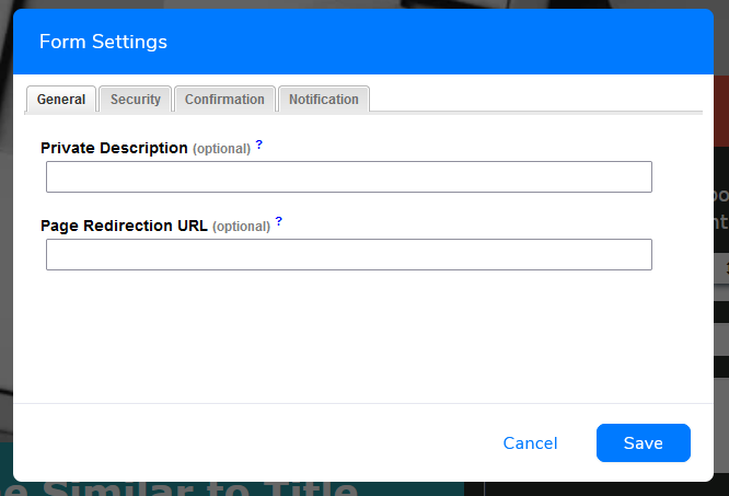
Form Settings is where you can set a redirect link, customize confirmation messages, set notifications, etc.
Below are some items you can customize to create a much more “personalized” user experience.
- General > Page Redirection URL – You can opt to create a “thank you” page or redirecting people to a specific page you want them to land on (e.g. homepage)
- Security > Form Protection (CAPTCHA) – Activate to protect your web form from spams
- Confirmation > Custom Page Message – If you do not prefer to redirect your visitors to another web page upon submission, you can also choose to add a customized message. If you leave it blank, the system will generate a default message.
- Notifications – You can choose whether you would want to receive email notifications upon every submission received.
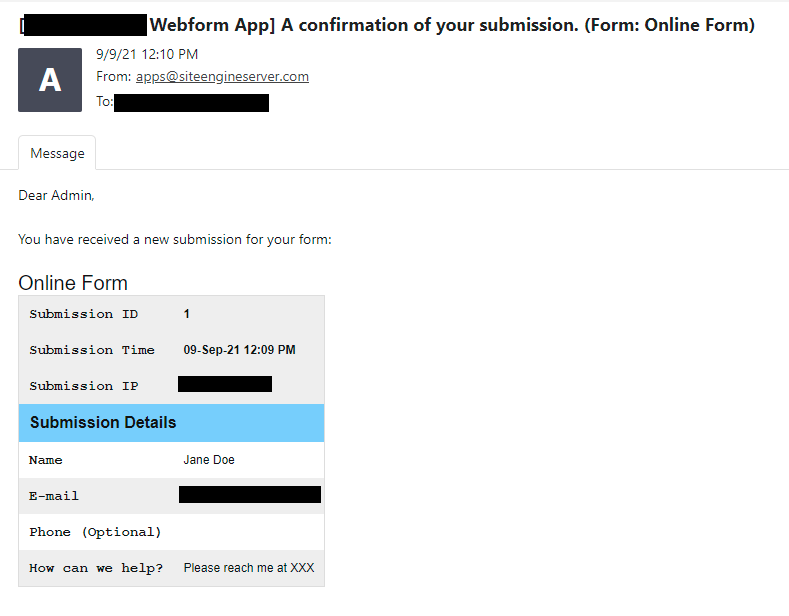
If you have enabled email notification, you will receive the submission notification email as soon as your visitors input their details.
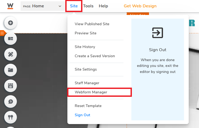
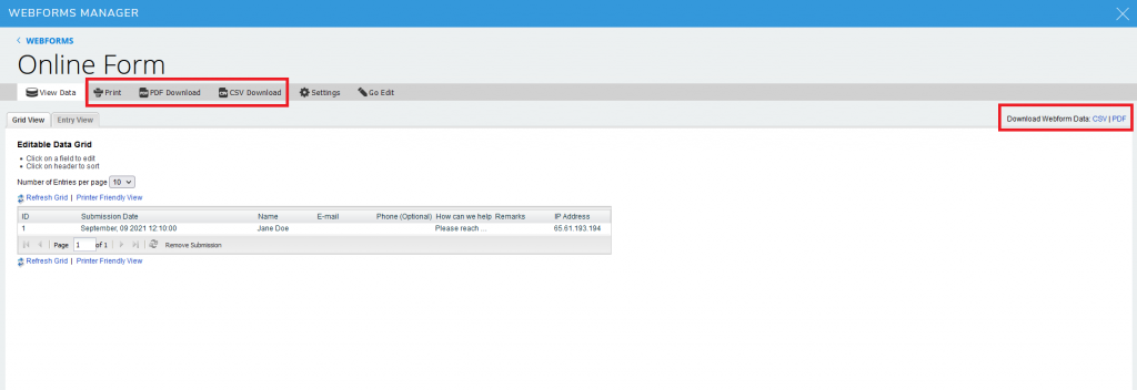
There are two ways for you to review all the data of your webform. You can go to Site, then click on Webform Manager.
Choose the web form that you would want to view (if you have more than one form)
Other than viewing, you can also print and download the data in CSV or PDF format
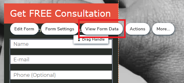
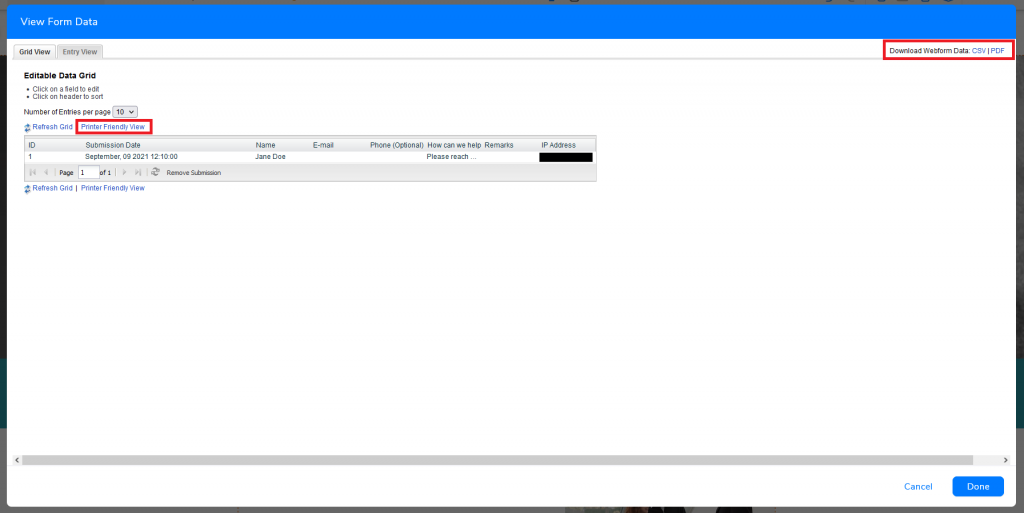
Alternatively, you can also select the web form in the visual website builder and click View Form Data.
You’ll also be able to print and download the data on this interface
CREATE A MOBILE VERSION LANDING PAGE
Mobile usage is increasing steadily throughout the past few years. There are nearly 6.4 billion smartphone users worldwide in 2021, and the number is expected to increase to over 7.5 billion in 5 years. According to App Annie, people on average are spending over 4 hours on their mobile phones. By the first quarter of 2021, more than half of the worldwide website traffic came from mobile devices. You can see the importance to create a mobile-friendly version of your landing page if you want to maximize every single minute trying to attract as many people as possible.
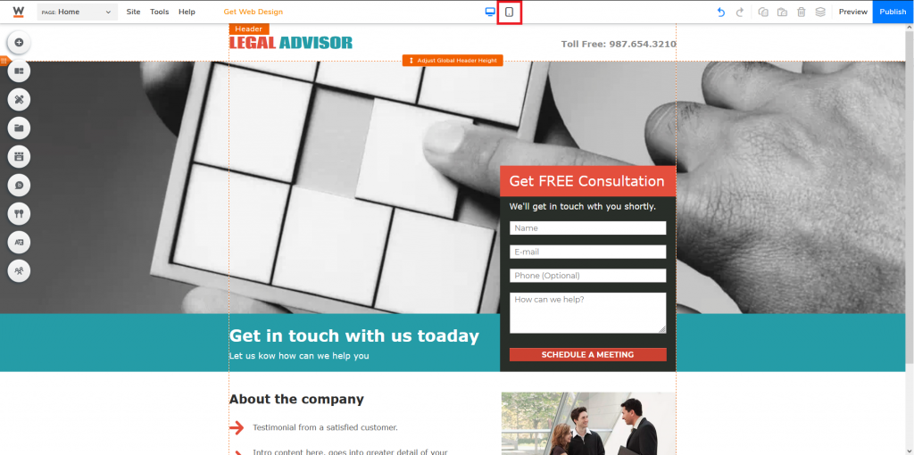
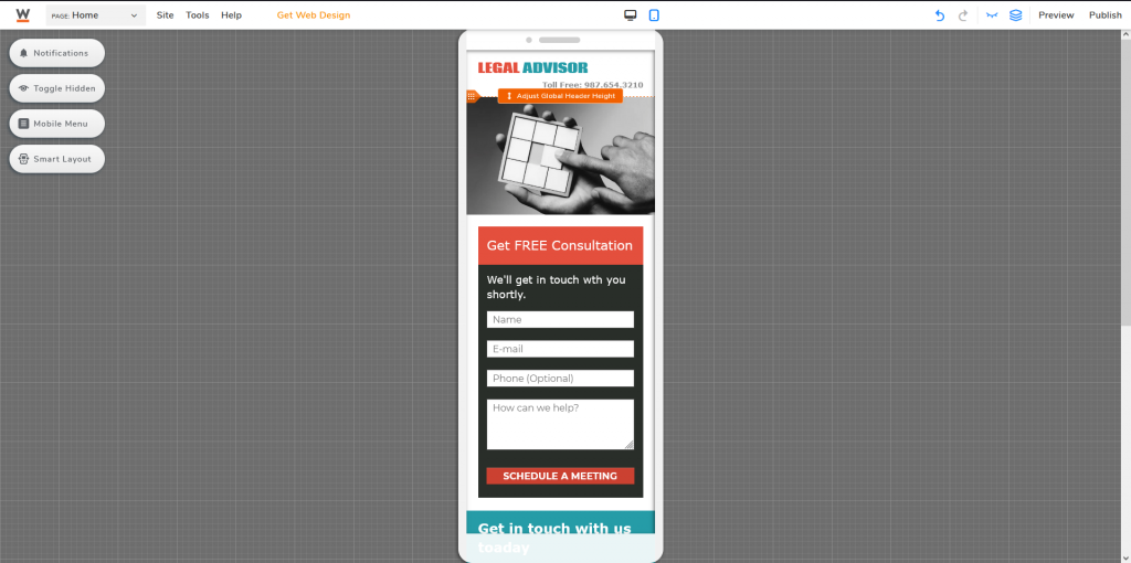
To create a mobile version of your landing page, go to the top middle area of your website editor and click on the mobile icon.
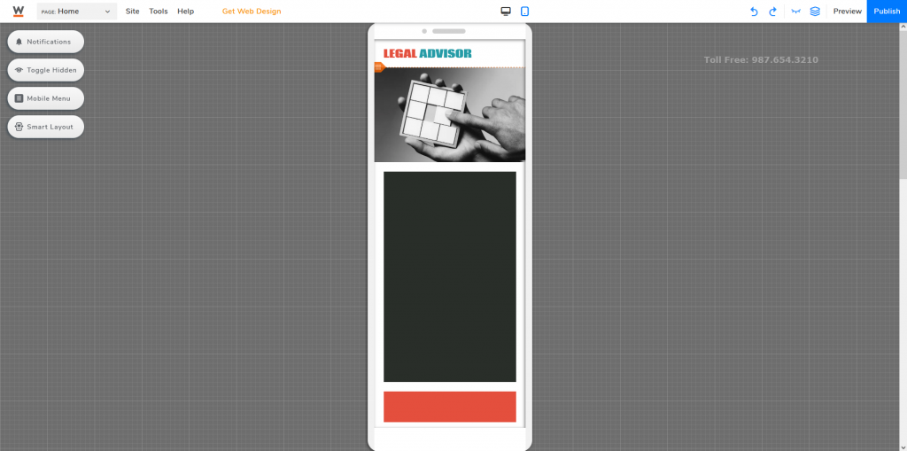
Once you’ve changed to the mobile editor, things might go all over the place.
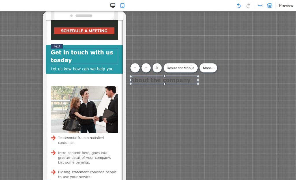
You will need to shift the elements one by one and optimize your landing page for your mobile.
And if you want to hide certain elements on mobile, you can just simply drag it out of frame or click on the specific element and press Hide From Mobile (the closed eye icon).
Note: You can only hide elements on the mobile version.
After editing and customizing everything, your landing page is pretty much ready to go. Switchback and forth between both Desktop and Mobile editors and do one last check. And when everything is good, click Publish to launch your landing page.
LANDING PAGE GOOD PRACTICES
It is very easy to build a simple landing page by using the website builder from Website.com and utilizing their pre-built landing page templates. That being said, there are a few general good practices to keep note of if you want to maximize the potential of your landing page.
-
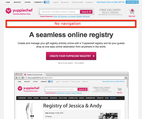
Keep the navigation options as little as possible
You are promoting a specific product/service, all you should do is to attract your customers, provide only what is needed without too many distractions. The more additional links you provide, the higher chance they will get lost getting here and there. Meaning, potentially they might not get back to your landing page, hence decreasing the conversion rates or lead generations.
-
Keep the most important content at the top
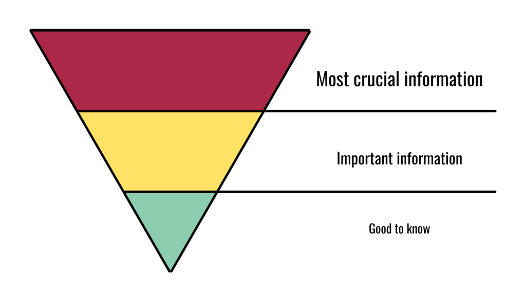
People on average spend 52 seconds on a webpage, sometimes even less. So what does that mean? If you have crucial information buried at the end of a webpage, there is a high chance an average visitor might not even get to that piece of content before leaving the landing page. Consider using the inverted pyramid structure when you are building your landing page. Put the most important piece of information at the top, followed by supplemental details, and background information at the end. While people generally will scroll past the fold, little by little people might be leaving your page as they scroll longer, if you don’t give them a reason to scroll.
-
Focus on what you can offer
This is a marketing page, you are selling a product or a service, or inviting people to participate in an event. Your first goal is to attract visitors. Give them a reason why they should be interested in what you are providing. Tell them what they can get from you if they’ve decided to engage with you.
Tip: If you are promoting a product and decide to add a navigation link to the product page, you can always add a temporary CTA button at the product page and remove it when your promotion ends. But remember, the more navigation options you have, the more distraction there will be.
-
Keep it clean and simple
The best marketing campaigns usually have one thing in common, they only have one goal. If you are promoting a product, your goal is to get visitors to buy the product. If you are promoting a conference, your goal is to get people to sign up and pay for the tickets. The number of links on your landing page shall reflect the number of goals, we call this attention ratio. And ideally, the attention ratio of your landing page should be 1:1.
Market-leading A/B testing tool VWO once helped their client to conduct an A/B test focusing on conversation rates. They found out that by removing the navigation menu on the website, the conversation rate increased by 100%.
Source: VWO
-
Make your CTA button obvious
Your CTA button is how you generate more conversions, this is among the most important elements of your entire landing page. It should stand out from all other elements, so your visitors won’t miss it. Also, try to avoid using a generic word/phrase like “submit” or “contact us” instead of going for a CTA related to what your landing page is about. In fact, a study by HubSpot revealed that customers generally prefer personalized CTA. Personalized CTA tends to convert 202% better than default ones generated by the system.
For instance, in this example, it’s a legal company and its goal is to convert visitors to clients. So rather than a simple “Contact us”, I’ve changed it to “Get FREE Consultation”; rather than a simple “Submit” button, I’ve changed it to “SCHEDULE A MEETING”.
Remember, the purpose of a landing page is to generate leads. Whether you aim to promote certain products or services, attract and obtain contact information from prospective visitors for future marketing purposes, or redirect visitors to a specific page. The main goal of a landing page is basically to persuade your visitors to take action. Make sure you are giving clear and straightforward instructions. Rather than having them figuring out what to do, you should tell them what they should be doing.
Now that you know what a landing page is, how can you create it using the website builder that I’ve suggested from Website.com, and some landing page good practices. It’s now time to create your own landing page and start promoting your business!
