How Much Content Is Too Much For a Web Page?
Have you ever found yourself putting all kinds of content on a web page because you think everything is important, just to end up with an overwhelming web page? No worries, you are probably not the only one. For instance, that’s me too.
As a creator or a business owner, every piece of information seems extremely important to us. This is not incorrect, more information means more details, which potentially means more reasons for people to trust your product or service.
But there’s also an issue with this all-in approach, especially when you’re crafting a homepage. The more you put on a page, the higher chance you will mess up with the design simply because it is too packed. You are also at risk of losing traffic due to a bad user experience.
A good design is all about a good balance of different elements.
- Too many words → Dull looking, visually unpleasing
- Full with visuals → Not professional enough (with some exception for those involved in the creative industries)
HOW TO CRAFT A WELL-BALANCED WEB PAGE?
Focus on crucial information
People usually know a thing or two before landing on your website. Either someone introduced your website to them, a recommendation from some other blogs, from the search engine results page when enquiring something, or from social media. Regardless, people would have already known some basic information about who you are and what you provide. They just need some extra persuasion and means of contact.
Say if you are thinking about what to include on your homepage, one easy way is to figure out what is crucial based on the “5Ws”. Additionally, if you can show visitors who you are, show them. Not only can you make your website more visually appealing, but you are also making your web page less wordy.
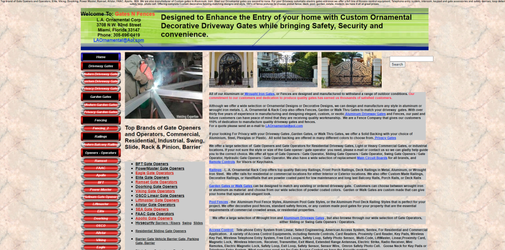
Example of a very wordy homepage with limited visuals, body text font size ranging between 12pt to 14pt. Making it hard for visitors to focus even when the website owner has bolded and uses different colors for certain content, simply because all the content is tightly packed.
(Source: http://www.gatesnfences.com/)
Neat and tidy please
It is very important to have a clean-looking web page so it is easy for your visitors to navigate around. The ultimate goal for having a website is to reach out to a wider audience and potentially convert them into leads. How to achieve this goal? People will have to be able to get to where you want them to be. Just take a second to take a look at the example below.
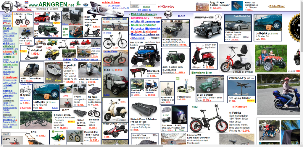
(Source: https://www.arngren.net/)
Messy layout, confusing typographic hierarchy, unclear color usage, inconsistent image sizes, packed navigation links. With all these issues all piled up on a web page, your visitors are very likely to feel overwhelmed. They will just choose to leave your website and there goes another potential customer.
Make use of visual content
Not everyone likes to read and not everyone can digest textual content well. Similarly, while not all contexts could work well with non-text content, messages behind numbers and data can be amplified using graphs and charts.
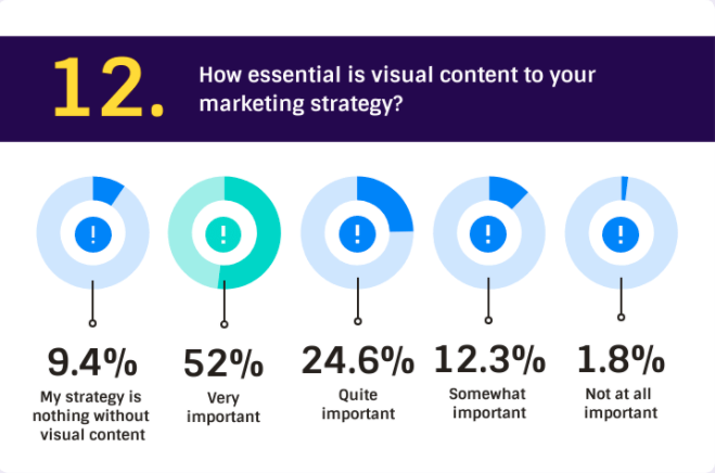
Take a walk around your neighborhood and look at all the advertisements, pretty sure up to 90% of these advertising posters will make use of imagery to deliver their message. We are so used to seeing visual content to a point where even more than half of the online marketers said visual content is essential to their marketing strategy.
Source: Venngage
Visual content is generally much easier for people to consume and remember. It also helps to keep audiences engaged with your content and acts as an interesting “break” between paragraphs. People are more likely to stay longer on a page with nice, interesting, and useful visuals.
PLAN, ORGANIZE, AND SPREAD OUT YOUR CONTENT
A website is like a book. You don’t only have one single page but multiple pages giving readers context, and all are divided into different chapters depending on the story.
Similar content applied on website building, think about the structure of your website before you jump straight into creating one. Each page serves different purposes:
- Homepage → The “face” of your website, the first impression
- About Page → Who you are?
- Contact Page → How can people find you and reach out?
- Blog Posts → A bunch of web pages for people to share their expertise
SO, HOW MUCH IS “TOO MUCH”?
I personally believe that there is never “too much content”. People are always searching and craving for more. However, this “too much” scenario occurs when people try to put everything together, all on one page.
There are a lot of different ways to design your website. You can definitely go more text-focus or more visuals depending on your industry and how you wish to present yourself to the world. But the general rule of thumb, never overwhelm your visitors. Give the “just enough” amount of information and invite them to explore by providing good navigation.
Your goal is to retain people’s interest in your website and have them explore around, rather than abandoning your website because it is “too much”.
Now take a look at your website and see if you can focus on scrolling around. If yes, you are good. If not, consider redesigning it.
If you don’t have a website yet, try out Website.com’s website builder. It is free for the most part and you can easily master the tool. You can also check out this guide to learn the basics of how to build a website using their platform. The downside is that your option to customize the website will be relatively limited compared to content management systems like WordPress. Which also has a much steeper learning curve.


