How to Build Your Own Website?
A landing page helps you to maximize your sales or attract potential customers, but the nature of these pages could also potentially be stopping you from achieving more.
Creating a clean, simple, and straightforward page is the key to a successful landing page. However, that could also mean that you are sacrificing some additional useful information in order to achieve this goal. This is when having when a website comes in handy. Not only by offering valuable content to further persuade your visitors to take another step, but you are also building up your online presence and establishing your credibility.
Step-by-Step Guide for building a website
Say if you are organizing a conference, you’ve created a landing page with key information including conference title, date, venue, speakers’ names and affiliations. However, your visitors also want to obtain more information before registering for the event, things like speaker bios, conference agenda, conference sponsors, and even you, the organizer of this conference. By having a website in addition to a sole landing page, you can now provide as much information as needed without worrying about people leaving the website to search for more information. And worse, not returning to your promotional page (the landing page).
You are the owner of your website, you have the authority to guide visitors on how to navigate through a website. And eventually, guide them to where you want them to be. View landing page as your first step to capture attention and attract visitors, the website will be providing additional information persuading visitors to take action, while keeping them within your reach.
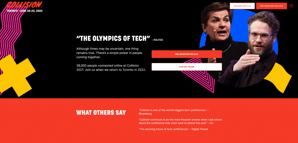
Collision conference is a good example of a conference landing page. It is eye-catching, has a consistent design, easy to navigate, with pages providing further details of the conference.
WHAT PLATFORM TO USE?
There are a lot of different products online offering the opportunity for people to build their websites. And if you’ve got no prior experience or knowledge, you might not even know what to start! I have experience using different platforms, from content management systems (CMS) like WordPress to website builders including Squarespace, Website.com, Wix. Each has its own pros and cons, all depending on your level of expertise and actual needs. While you might be tempted to go for the “most popular” option mentioned by all kinds of people, choosing the “wrong” platform might eventually do you harm, especially if you’ve got zero clues on what and how to build your website.
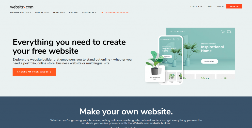
After testing out and jumping back and forth on all these platforms, I would recommend using Website.com, particularly for beginners. It is a simple drag-and-drop website builder, beginners can easily build a website using one of their specially crafted templates.
-
Easy to use
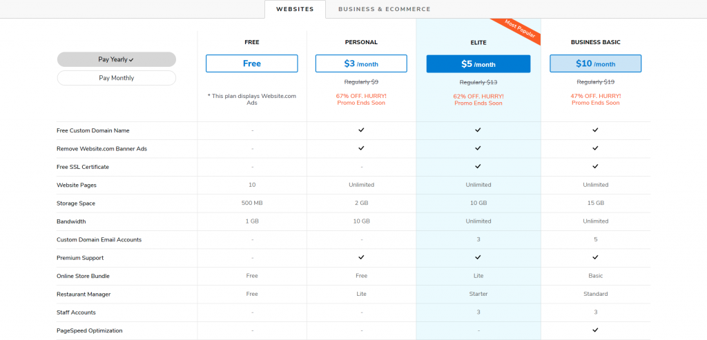
Many website building platforms provide free plans with very limited functions, or free trials for users to experience the full services of a website builder for a limited time period, usually for 14 days. Website.com’s free plan gives users access to essential functions for creating a website. Users have the freedom to stick with the free plan as long as they want, or upgrade their plan to increase functionality and add different features to their website when needed.
-
No security updates needed
Oftentimes when you use CMS platforms that are built with open-source scripts, such as Joomla and WordPress, users will need to perform security updates by themselves regularly. However, if you choose to use website builders like Website.com, their developers will be in charge of all the security updates.
-
You can try out their service for FREE
You can find different website building platforms that offer free plans, but a lot of time, these plans come with very limited functions. Some might offer free trials with full services capabilities, often for a limited time period like for 14 days. The good thing about Website.com’s free plan is that it offers almost all website building essential functions, without the need to pay a cent. If users opt to stick to the free plan, they definitely have the freedom to do that. At the same time, users can also upgrade to a paid plan to increase the functionality and even add different features to their website as it grows.
Following this step-by-step guide, I will help to smoothen your website building process using the website builder from Website.com.
CREATE AN ACCOUNT
First off, go to Website.com and register an account.
You can sign up for their free plan and try out most of their website building features. If you are happy with their service and feel like you’re ready to expand and upgrade your website, you can always switch to a paid plan, which comes with a free custom domain name.
WHAT IS A CUSTOM DOMAIN NAME?
Choosing the “right” domain name is essential to your website since it represents who you are or what your business is about—both online and offline.
Here are some tips on how you can create your domain name.
- For Business sites – CompanyName
- For Personal sites – FirstNameLastName, NameProfession, NameHobby
Tips on choosing your domain name
-
Stick with .com
As the online world continues to expand, it might be harder for newcomers to register for an “ideal domain name” if the name combinations are commonly seen. One way to still stick with their “ideal domain name” would be to register their website using new domain extensions such as .co, .ai, .app, .io. However, I would strongly suggest sticking with the traditional .com, .net, .org domain extensions if possible. Not only are these the most common ones, but these domain extensions also look credible and professional. And most importantly, these are usually the first thing that will come into people’s minds when typing, particularly with .com.
Note: If you are a small business or your intended audience is in a particular location, you can also opt to use country-specific extensions (country code top-level domain, ccTLD) like .us, .co.uk, .ca, etc. There are, however, specific registration requirements for certain locations—you need to be a U.S. citizen, resident, organization, or a foreign entity in the U.S. in order to register for a .us ccTLD.
-
Keep the domain name short
If you have a long domain name, you are basically increasing the chance your visitors might not get your domain right. The key is to keep your domain name short and memorable. In fact, Google typically suggests using 3 to 4 terms when creating your domain name.
-
Make sure your domain name is easy to spell
Other than keeping it short and memorable, be sure your domain is easy to spell and pronounce too. Try to avoid repeatedly using the same character, people could potentially misspell it. And if you need to slowly spell out your potential domain name so others could mark it down, this is a pretty good indication to think of another domain name.
CHOOSE A TEMPLATE
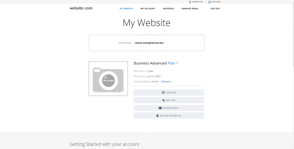
To start building a website, click Edit Site after setting up your account.
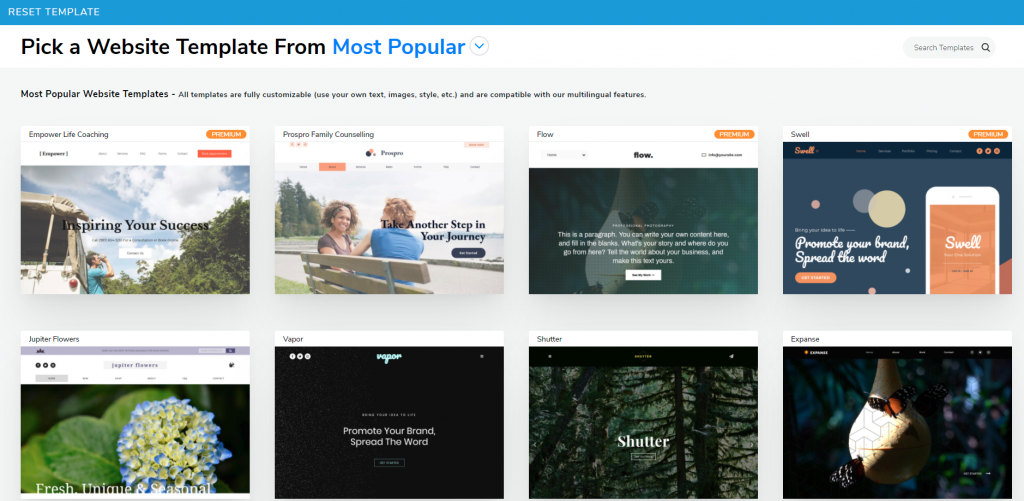
It will automatically bring you to the Website Template page with over 500 website templates designs, each built to fit different needs—portfolio website, restaurant website, landing page, legal consultation website, etc.
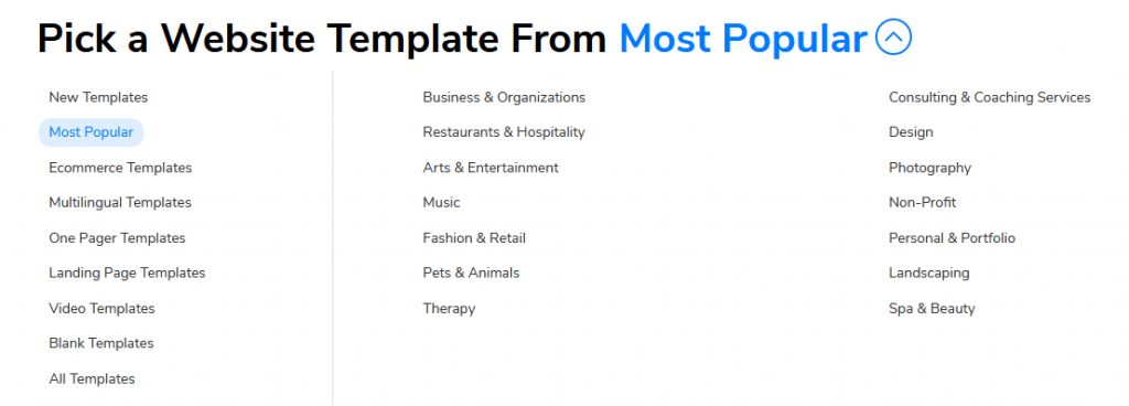
Click Most Popular and a drop-down menu will appear, showing all the categories of the website templates.
You could also build your website from scratch. But unless you have extensive experience in building one, I would strongly suggest you stick with one of the templates and customize it. Even if you can’t find a template that entirely fits your needs, say the images shown are not relevant to who you are or what you do, you can always replace the text and image to further customize it. The benefit of using templates is that these are pre-built website templates with elements such as fonts and colors handpicked and designed by professional website designers, placeholder texts/images are here to show users the layout of the website design.
One Page or Multi-page
Think about how you would want to structure your website when choosing a website template, this could also affect which template you should be using and build up upon. Do you want an all-in-one one-pager website or separate the content into different pages? It is all about how you would want your visitors to navigate through your website when clicking the menu bar.
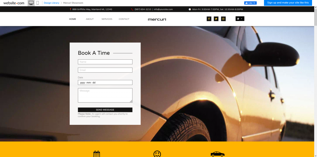
One pager example: Mercuri Showroom
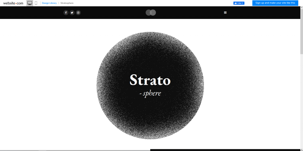
Multi-page example: Stratosphere
Once you are set with a design, click Select and it will bring you to the Website Builder.
ADD WEBSITE CONTENT
I always suggest first input your content before customizing the design of your website. After all, without content, you won’t be able to finalize how you want to visualize the final product.
You can add as much as you want. In general, these are the 3 must-have elements
-
Homepage
Your homepage is usually the very first page your visitors will come across. This is your chance to present your visitors with a good first impression. When visitors visit your homepage, they should quickly have an idea of what this website is about.
-
About Me
Never underestimate this part. This is where you tell your visitors who you are, what you do, your background, and what you can offer.
-
Contact Me
Your website wouldn’t be complete if there is no indication of how people connect with you. Whether you are promoting a business, expanding your network, or just sharing your hobbies and interests, the reason to create a website is to connect with people. Some common information that you should provide includes your email, phone number, and/or address (if you have a physical store).
There are great benefits to using pre-built templates to build your website, you can make use of all existing fonts and colors handpicked by professional web designers. Existing placeholder text and images show you the layout of the chosen template, feel free to change and replace the placeholder text and images to suit your needs. If you are unclear about which font the template is using, you can simply Copy & Paste the text and paragraphs to keep the style consistent.
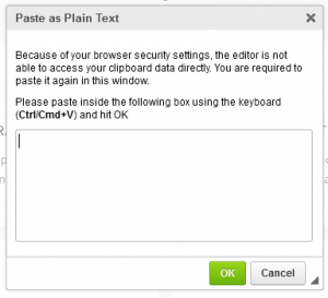
There are mainly two ways to add text—type directly in the website builder or alternatively, type somewhere else (e.g. Google Docs) and paste it into your website. A simple copy & paste will generally work. However, there might be instances where you might also be bringing over some embedded formatting. If you wish to stick with the selected font designs from the template, you can right-click your mouse and select Paste as Plain Text
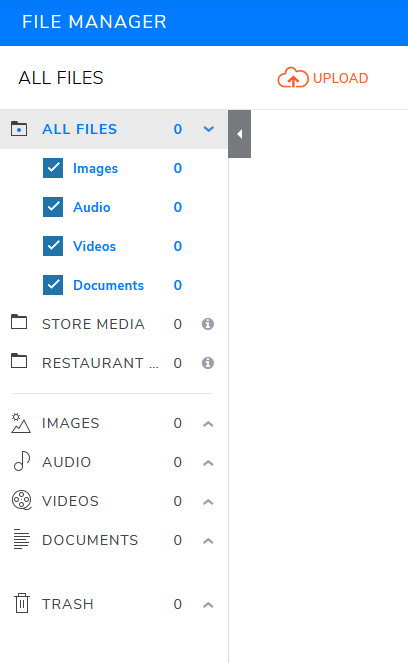
To add multimedia elements, click Add Elements and choose either Image or Audio & Video to add your content to the page. File Manager is where you can upload the files and edit these multimedia elements. Please be aware of the storage limits depending on your chosen plan. If you require more storage space, the simplest way is to upgrade your plan.
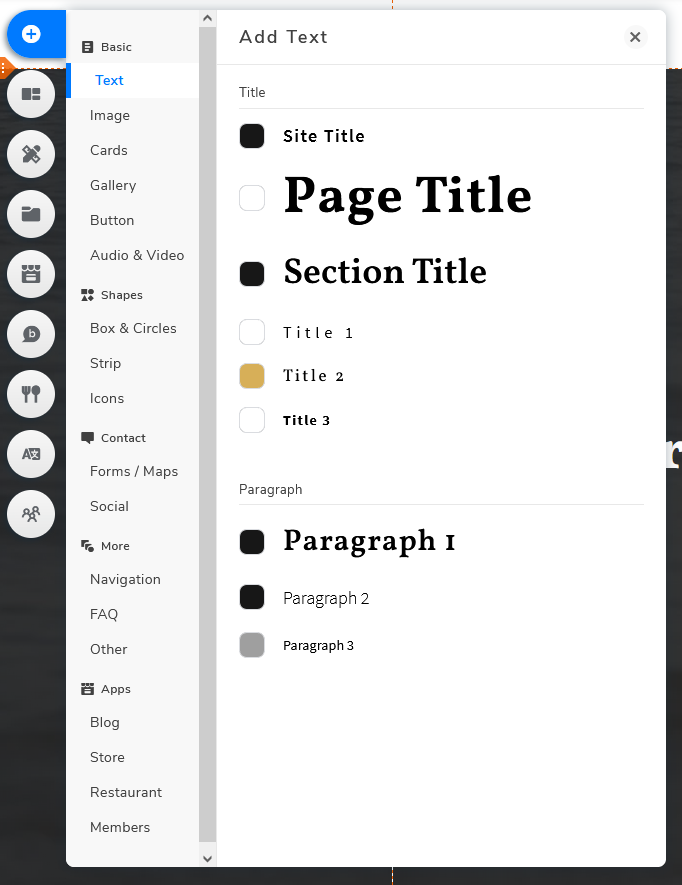
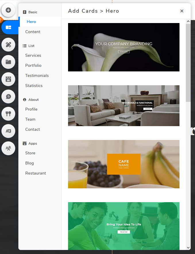
If you want to add additional content to your website, you can do so by clicking Add Elements or Add Cards.
Add Elements
Add Cards
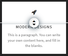
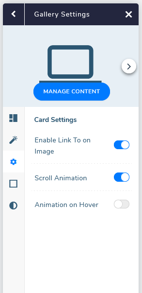
You might wonder what is the difference between a card and an element? They are both essentially additional contents, but cards are built with interactivity in mind. By using the Add Cards option, you can utilize the already built-in functions like animation and proportion adjustment of elements.
Add Proportions
Animations
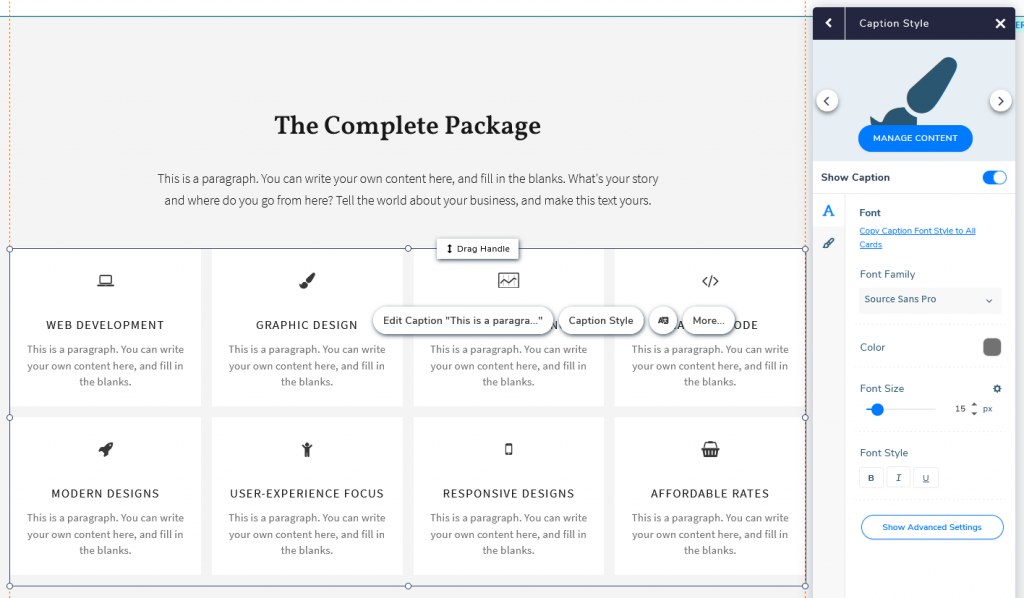
Tip: Imagine you have multiple elements in the same card. You edit one of the many elements and wish to apply your changes across the entire card. Rather than doing it one by one, click Copy Font/Image/Icon Style to All Cards to apply the same changes to all elements.
ORGANIZE YOUR WEB PAGES
One Page Website
A one-pager website is simply a website where your visitors can quickly navigate between different sections without switching and reloading a brand new page. All information is shown on the same page.
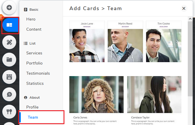
To better demonstrate the process, I will be adding a “Meet The Team” section
Add Cards > Team
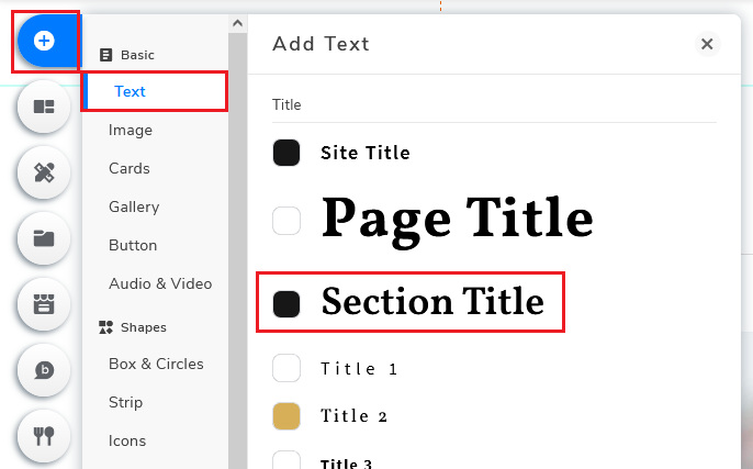
Add Elements > Add Text
Title > Section Title > “Meet The Team”
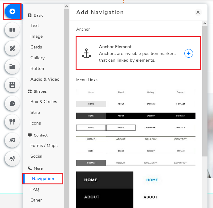
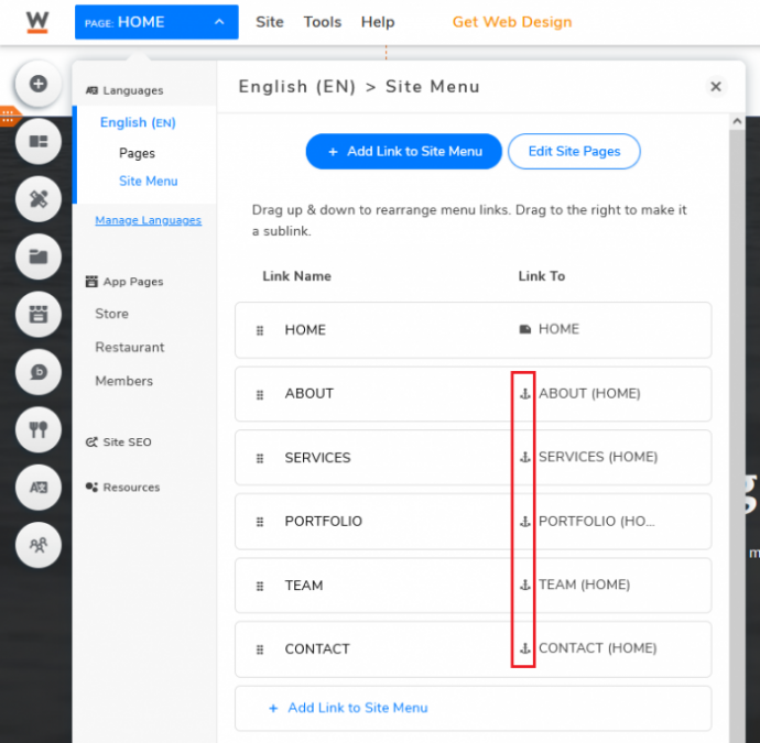
In order to allow visitors to quickly navigate to the “Meet The Team” section by using the menu bar, I will first need to create an anchor. Go back to Add Elements again, this time click Navigation and click Anchor Element.
Add Elements > Navigation > Anchor Element
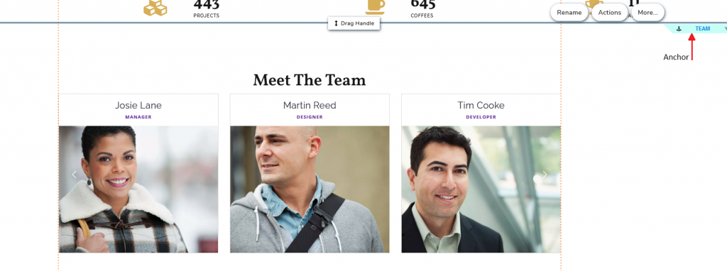
Drag to “Meet The Team” > Rename “TEAM”
Drag the Anchor to where you want your section to start and rename it. This is basically the “point” your visitors will “jump to” after clicking onto the source anchor.
Next, you will need to create a link in the menu bar.
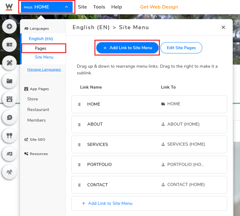
Click on the Page button located at the top left corner (right next to Website.com’s logo).
Under Site Menu, click Add Link to Site Menu.
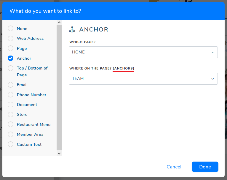
Next, select Anchor to create an anchor link.
Choose the page (for this example: homepage) and how you will want the link to respond.
Note: The “Anchors” is the Anchor Element that you’ve created
Multi-page Website
Multi-page websites typically allow you to provide more detailed content to your visitors by separating content into multiple pages and sub-pages.
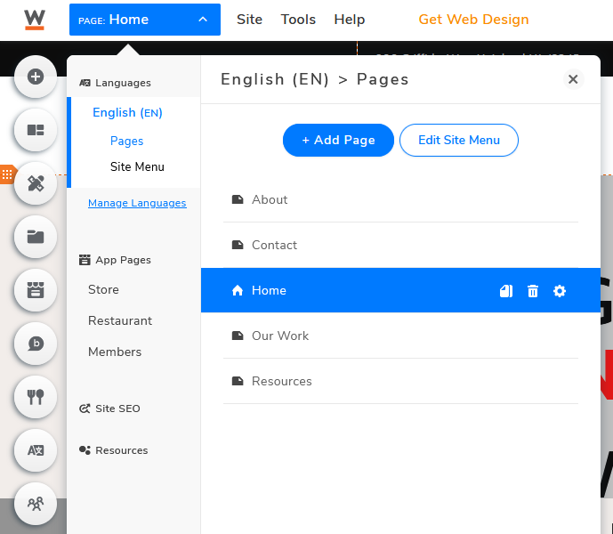
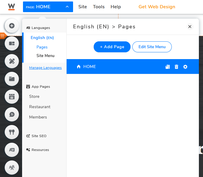
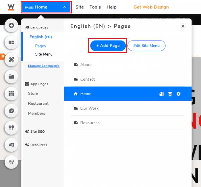
When you click the Page button, you will see multiple “pages” listed under this section, rather than just one single “page” when using one-pager templates.
Multi-page template
One page template
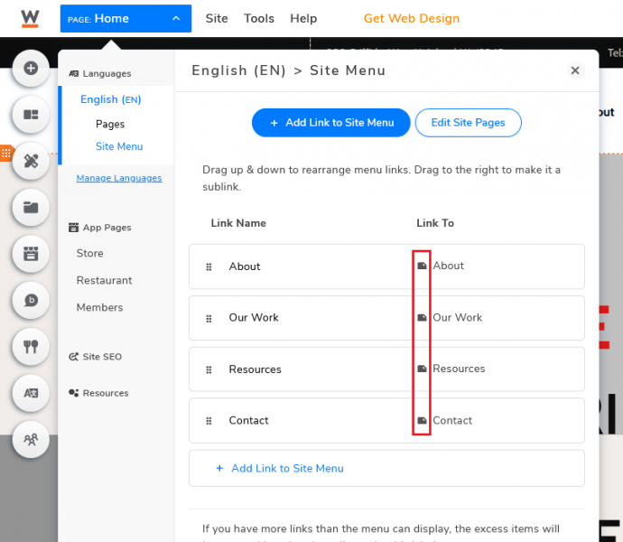
(Multi-Page) Links – Pages
(One-page) Links – Anchor
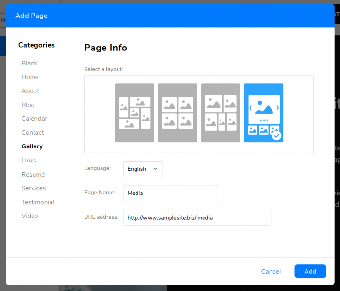
To add pages for your multi-page website, click on the Page button (right next to Website.com’s logo) and select Add Page.
Depending on what you need, you can choose to create a Blank page and input cards and elements one by one, or simply create a page using one of the templates. Once you know what you want, click Add and the system will generate the web page that you’ve selected.
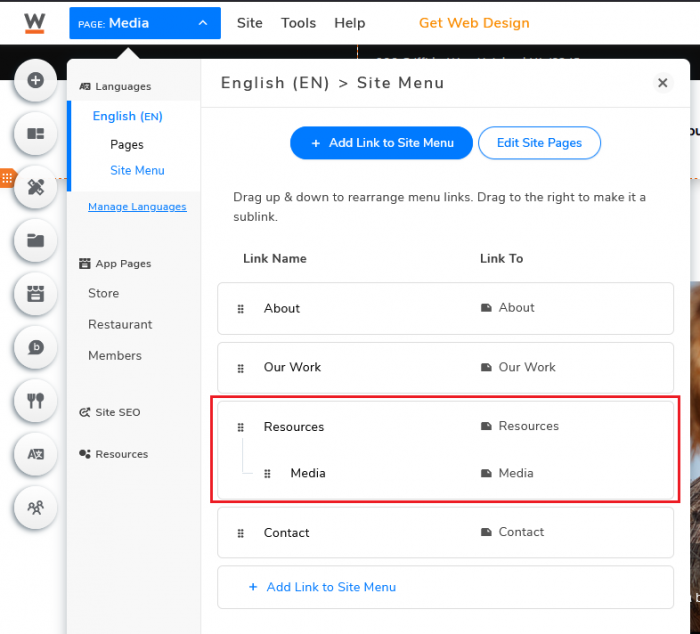
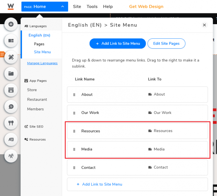
To make it a sub-page, go to Site Menu and drag it to your desired location, slightly drag to the right.
Menu Bar (sub-page)
Menu Bar (separate page)
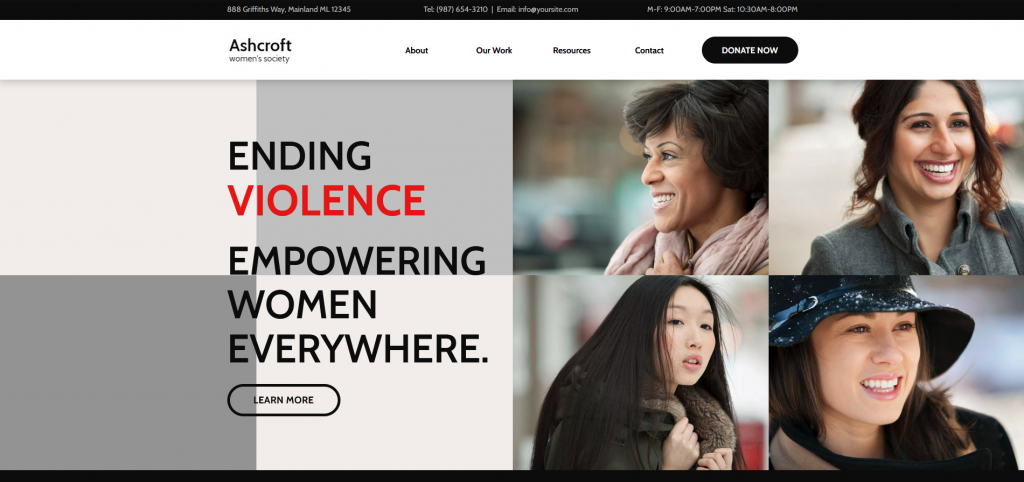
Multi-page template example: Ashcroft Women’s Society
OPTIMIZE FOR MOBILE DEVICES
There are 3.8 billion smartphone users in today’s world, a rough 48% of the world’s total population. Digital marketing agency Wolfgang stated that over 70% of current website traffic is coming from mobile devices. It is no longer a “just nice to have” element, you need to have a mobile-friendly website. If you don’t optimize your website for the mobile screen, not only will your visitors find it difficult to navigate through your website on their phone, they will very likely choose to leave immediately.
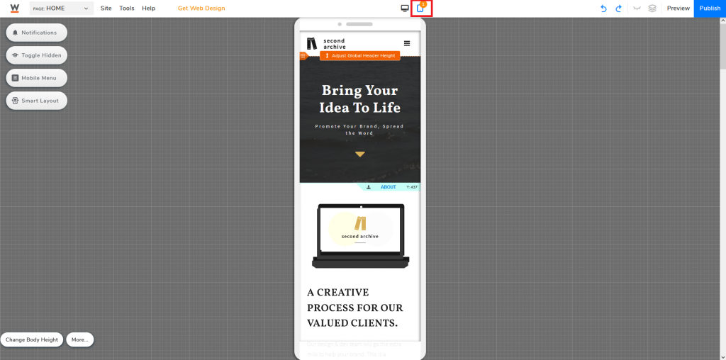
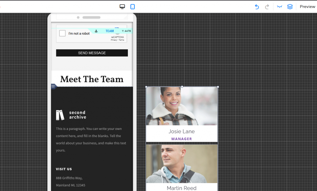
To open the mobile editor, you will find the Mobile button at the top middle of the website builder.
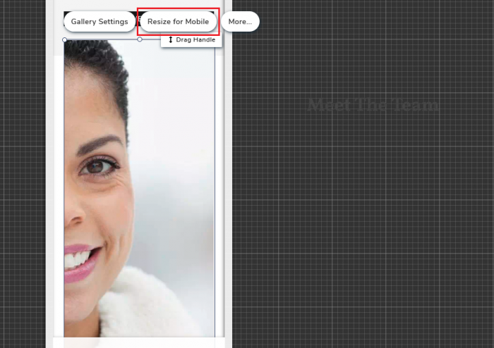
The system will automatically readjust and reorganize the content for mobile. However, if some of your content is still out of frame or not compatible with the mobile screen, click on the specific element that you would want to edit and choose to Resize for Mobile.
The mobile version allows users to hide certain elements by dragging them out of frame. Alternatively, you can click on the element and select Hide From Mobile.
PUBLISH YOUR CONTENT
Remember to click Publish once you have finished building your website, and whenever you make any changes in the future.
Congrats! You now own a website!
Website building is definitely a timely process. Even with a step-by-step guide, there are still a lot of customizations needed to build an “ideal website”. After all, we all have our own preferences when it comes to how we would want our website to look.
Now that you have successfully launched your website, you can start planning to level up your content game and get your website noticed by others!
