Why do you need a contact page?
Tips on how to maximize your contact page and convert visitors to potential leads
You spent hours crafting a website, with tons of content, a perfect design, and people can easily navigate between your web page. Everything is just perfect, you are seeing more and more traffic. But there’s one big problem, you didn’t tell visitors how can they contact you. So even if you are getting huge traffic, you still won’t be able to convert them into potential customers.
Just imagine seeing a very interesting product that you really like, but you have no way to ask for details simply because you have no way to talk to the shop owner. Will you continue shopping in this particular store or move on to another store that sells the same product and you have a way to communicate with them via any channels stated on their Contact Us page? Most likely the latter option!
A Contact Us page, at its core, aims to convert your visitors into customers and leads. It is a central hub providing ways for people to get in touch with you or your business using different channels that you are offering.
CONTACT US MUST-HAVES
There are tons of different types of Contact Us pages. But in general, these pages will include:
-
Contact Form
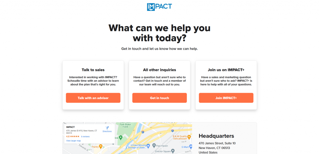
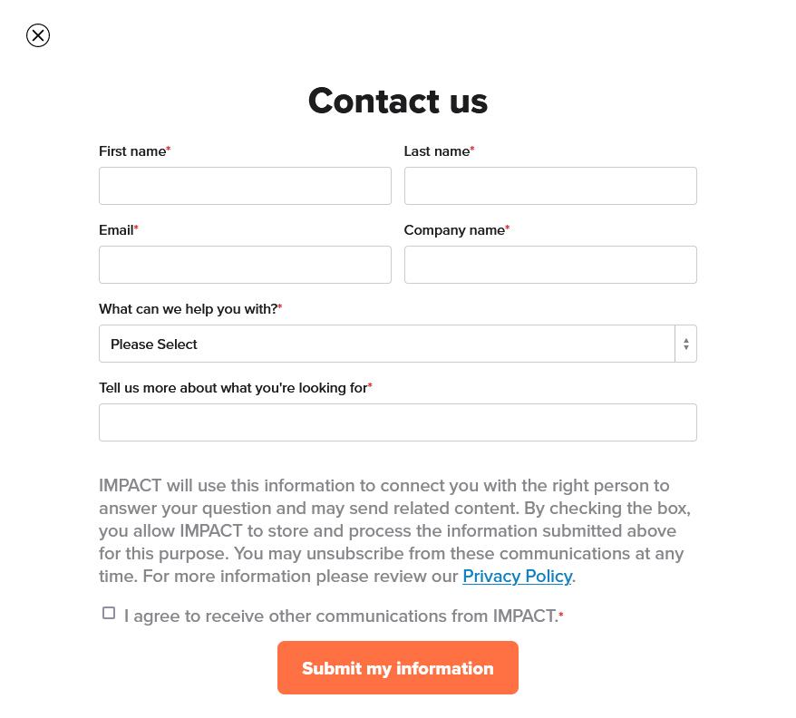
Similar to email inquiries, a contact form is essentially a channel allowing people to send in text inquiries. For a general user, it is still very similar to sending emails since most likely other than your first inquiry, everything will be done via email once the website answer responds. The major difference will happen on the form owner side, as contact forms assist owners in gathering information within the system. It is essentially streamlining the process for better organization and prioritization of data, so form owners can respond accurately and quickly. A good contact form should be easy to follow, short, and straightforward.
Source: IMPACT
It is a good practice to set certain fields mandatory (“Required Fields”). If visitors don’t fill up certain fields, they won’t be able to send out the webform at all. This could avoid missing any vital information such as the person’s contact information.
-
Multiple ways of contact
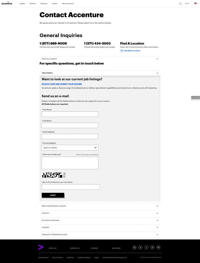
Different people got different preferences when it comes to reaching out to others. Some are straightforward web form input type, some prefer talking over the phone, some would want to explain in detail via email, while some prefer to talk in person. While a general contact webform shall handle the majority of the job, it always doesn’t hurt to provide different options catering to different needs and preferences. You’re also presenting yourself as a flexible and welcoming website (business), open to connecting with different kinds of people via any method they would prefer and feel most comfortable with.
Additionally, say if someone would want to collaborate on a project and needed to send in attachments. Unless your web form already allows, providing additional methods like email contact would address this situation.
Source: Accenture
-
Map (if you have a physical store)
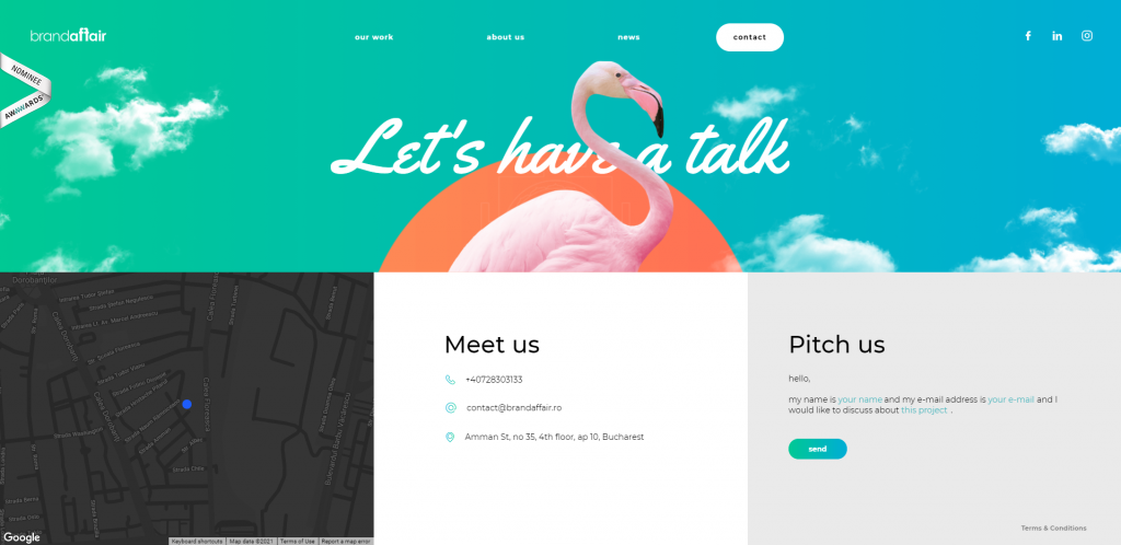
The human brain possesses visual data better than text and any other data, a MIT study even found out that our brain can process images as little as 13 milliseconds. When you provide a map alongside the address, you are saving your customers’ time in trying to figure out where your shop is. And potentially, saving your time trying to explain and give directions to your visitors when they are lost.
I strongly suggest not only providing an image of the map, but embedding a Google Map to your contact page. Rather than copy and paste the address from your website to Google Map, all they need is one click and immediately shown on the map. This is particularly helpful if your visitors are driving!
Source: Brandaffair
WHICH PLATFORM SHOULD YOU USE?
There are mainly two types of systems:
- Content Management Systems (CMS) like WordPress—offers more flexibility in customization, but also require more technical expertise
- Website Builders like Squarespace, Website.com, Wix—easy to use, don’t require much coding knowledge, but relatively less flexibility compared to CMSs.
Go for a website builder if you’re a beginner and lack coding knowledge, I am happy to suggest the website builder from Website.com. It is simple to use, and you can have almost all access to their website builder features for free and upgrade your plan to a paid one as you need.
HOW TO CREATE A CONTACT PAGE?
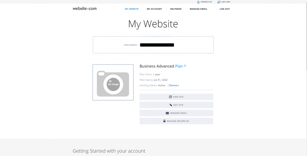
Log in or sign up for a Website.com account.
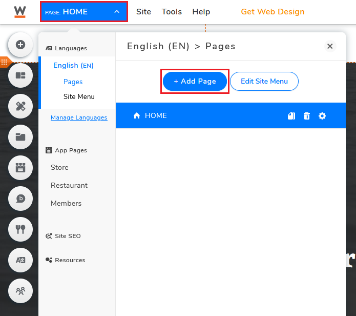
After selecting a temple, click Page and select Add Page.
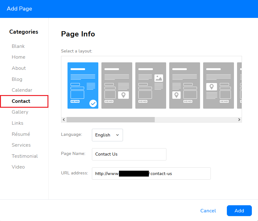
Choose your preferred layout for the Contact Page.
Choose Blank if you prefer to create a brand new contact page from scratch, but I would suggest sticking with the templates unless you have a clear idea of what you want.
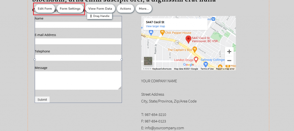
Click Edit Text to customize placeholder text cards.
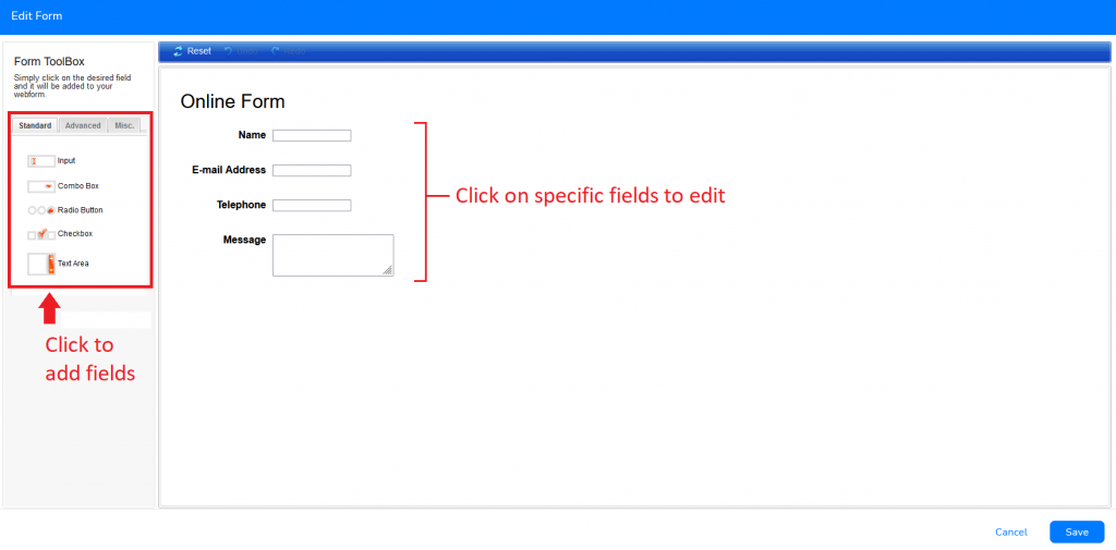
In this interface, you could choose to add/delete and further customize the fields according to your needs.
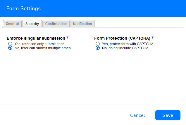
Form Settings is where you could change the settings of the web form, such as customizing confirmation messages, submission e-mail notification, redirection URL after submission, etc.
Under Security, you can also activate Form Protection (CAPTCHA)—Completely Automated Public Turing test to tell Computers and Humans Apart. CAPTCHA is a kind of challenge-response test used to identify if a “user” is a bot or a human, preventing spam form submission. Modern days tests have evolved from reading squiggly distorted text to image-based tests—from solving simple mathematical equations to selecting the right images according to a given instruction.
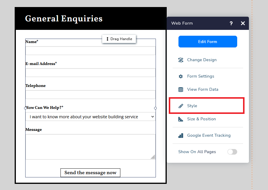
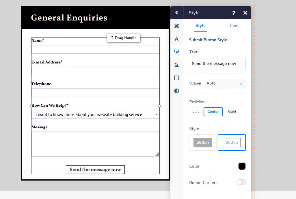
Almost everything could be edited in Edit Form or Form Settings interfaces. But if you want to edit the submission button, you would have to do it by clicking on your form, selecting More, then Style.
Above is a customized submission button example.
Select the third option and start customizing everything you want, the text, the font, to the design. I will further explain why we should be customizing the submit button in a bit.
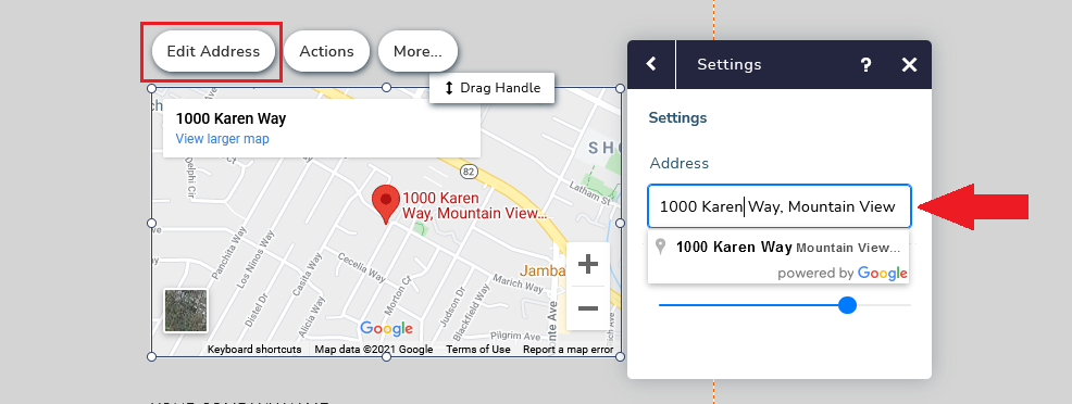
If you have embedded a Google map on your contact us page, you can simply change the address by selecting the map and clicking Edit Address. Google Map will automatically change update it once you’ve changed it.
And if you want to add additional content to your contact page, just go to Add Elements or Add Cards. Click here to know more about Website.com’s website building features.
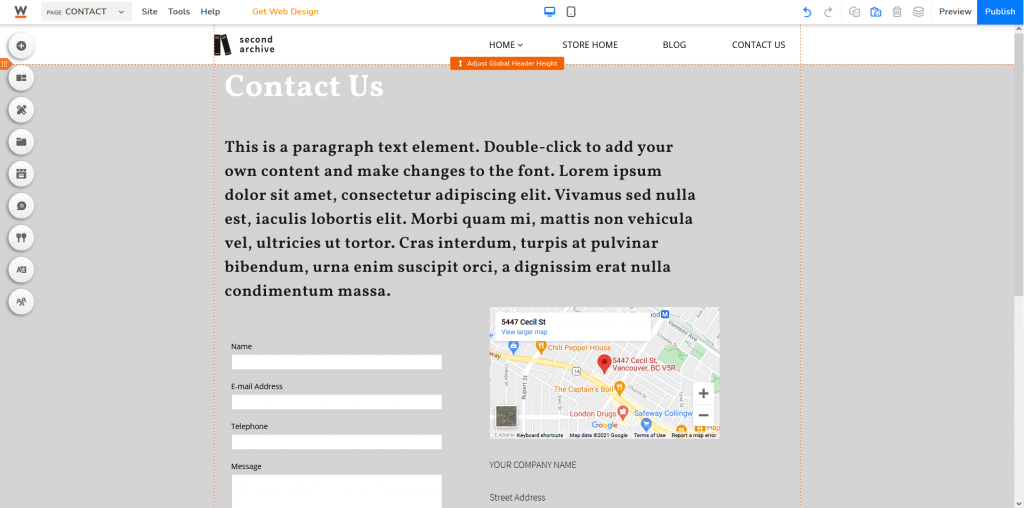
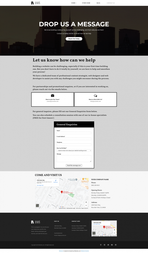
Here’s a Contact Page example for a website building company.
CUSTOMIZE FOR MOBILE
It is increasingly important to create a mobile-friendly web page. After all, more and more people are browning websites on the small device, anywhere, anytime.
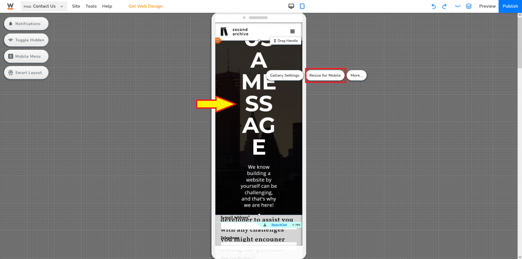
Click the mobile icon (top middle) of your website editor.
Not all elements will automatically be optimized for mobile. You have two options: Select the elements needed to be changed and click Resize for Mobile.
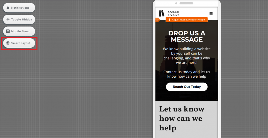
Second option: Activate Smart Layout.
Of course, you also have the third option, which might also be useful even after you’ve used the above two methods: Manual customization.
HOW TO UTILIZE YOUR CONTACT PAGE?
Catchy Call-To-Action (CTA)
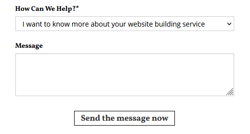
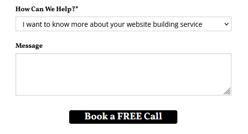
Giving extra instruction to your visitors is never a bad thing. Rather than general statements like “About”, wouldn’t it be better to ask your visitors “how can we help?” Guide them, give them a reason to reach out to you, make it a conversation with more human emotions. Incentivize them to take action, show them that you care. And If you think “Send the message now” is too dull, how about “Book a FREE Call”?
The same goes for other communication channels.
Add direction
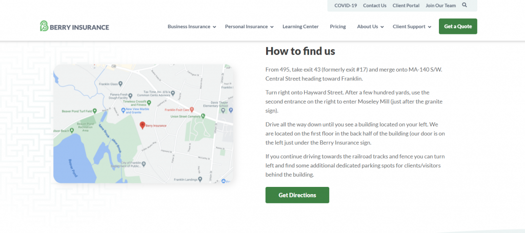
Some people prefer visual navigation, some prefer navigation by text, while some would want extra confirmation by having both. It would be great to provide both options.
Source: Berry Insurance
Make it attractive
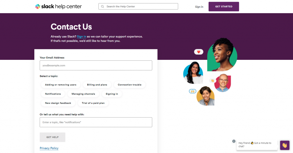
Some contact pages are dull, simply people or companies believe that it is not as important and decided to put this page at the end of their priority list. As a result? A very generic and standard contact page. A contact page is the first step to more engagement between website owners and their website visitors. Remember, these are your potential customers, every action that you make can either bring them closer to you or push them further away.
Add colors, graphics, icons. If there’s a specific theme and tone in your other web pages, the same goes with the contact page!
Source: Slack
Just having a contact page wouldn’t automatically make people reach out to you. Tell them why should they reach out. How can you help them? What can you provide? Incentivize your visitors to reach out to you knowing that they can get “something” in return. Personalize the messages, customize all the default ones. And you might be able to get a higher conversion rate if your message is attractive and eye-catching!
